


Table of contents

No headings in the article.
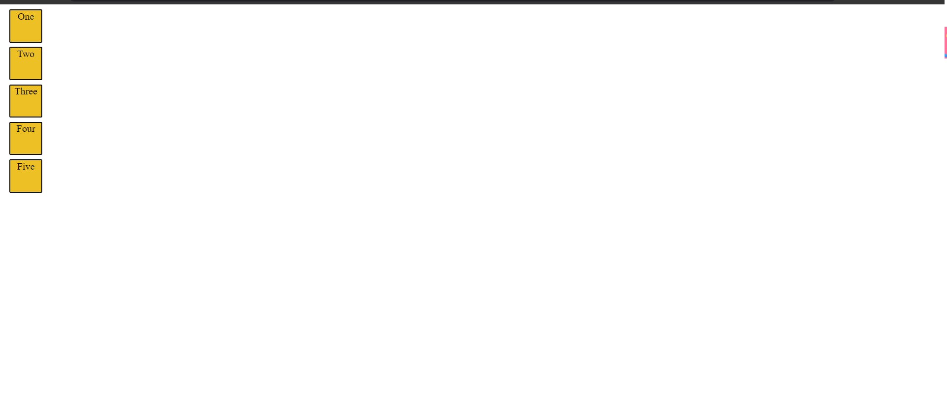
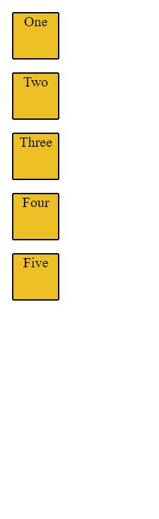
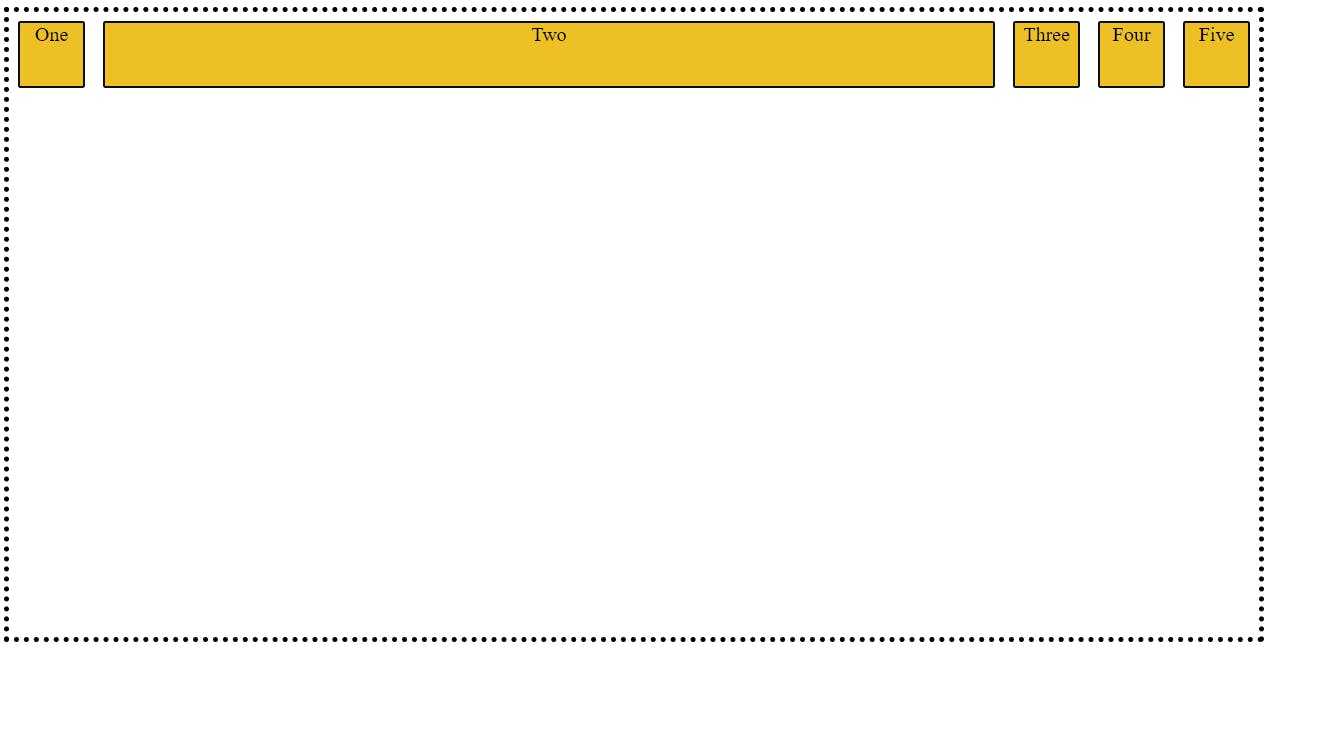
So, let's first understand why we need FlexBox. Assume we have following Box's on web page and want to set this box's in horizontal direction. How we can do?
<!DOCTYPE html>
<html lang="en">
<head>
    <meta charset="UTF-8">
    <meta http-equiv="X-UA-Compatible" content="IE=edge">
    <meta name="viewport" content="width=device-width, initial-scale=1.0">
    <title>Blog</title>
    <Style>
     .box{
        background-color: #EDC126;
        border: 2px solid #0D0D0D;
        border-radius: 2px;
        width: 50px;
        height: 50px;
        margin: 7px;
        text-align: center;

     }
    </Style>
</head>
<body>

    <div class="container">
     <div class="box">One</div>
     <div class="box">Two</div>
     <div class="box">Three</div>
     <div class="box">Four</div>
     <div class="box">Five</div>

    </div>

</body>
</html>
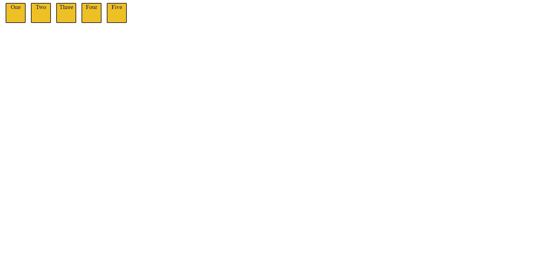
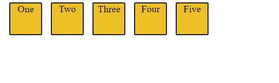
So, this problem can be resolve by using Flex-Box
.container{
        display: flex;
     }
Now, As we know in what way flex-box is useful let's started..
Flex-Box ->The flex-box is a property through which we can layout our web-page in one direction and it will make our life easy in control of the dimension and direction of the item's in web-page. Generally, we can say with the help of flex-box we give container an ability to maintain the direction and make the best use of available space.
Now Let's Understand The Flexbox Properties The flexbox property are divided into 2-part
- Properties for the parent
  -display
  -flex-direction
  -justify-content
  -align-items
  -flex-wrap
  -flex-flow
- Properties for the child
  -order
  -align-self
  -flex-shrink
  -flex-basis
  -flex-grow
First, we will explore the parents property
- display ->This property used on container which will enable flex property in the direct children of the parent
 .container{
        display: flex;
     }
- flex-direction ->This will provide the axis to the container which will describe the direction of the flex item's inside the container. There are 4 direction provided which are as follow
1.row(Default)
 .container{
        display: flex;
        flex-direction: row;
     }
2.row-reverse
 .container{
        display: flex;
        flex-direction: row-reverse;
     }

3.column

 .container{
        display: flex;
        flex-direction: column ;
     }
4.column-reverse

 .container{
        display: flex;
        flex-direction: column-reverse;
     }
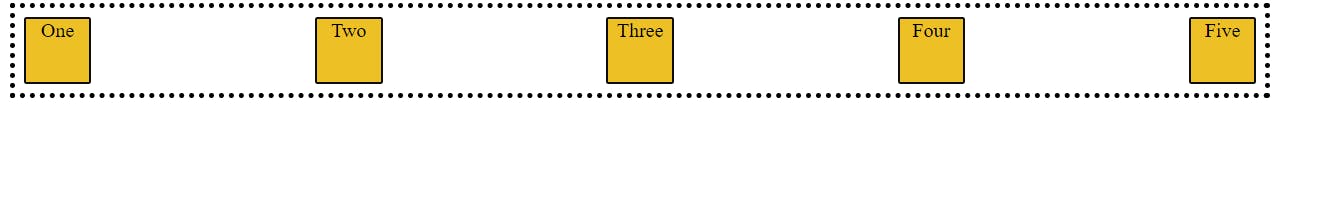
-justify-content -> This is used to give the alignment on the main-axis(flex-direction).This property help us to use the free space in best possible way
1.flex-start -> it is default property, the item's inside the container will moved toward the start of the axis with even space distribution
.container{
        display: flex;
        flex-direction: row;
        justify-content: flex-start;
     }
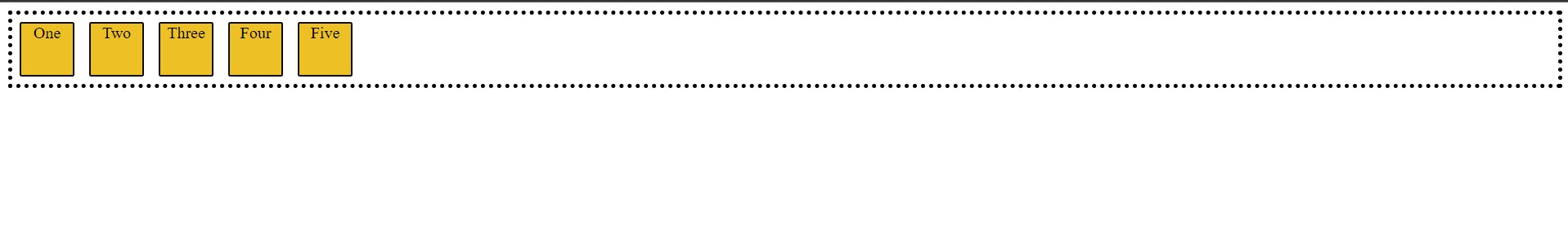
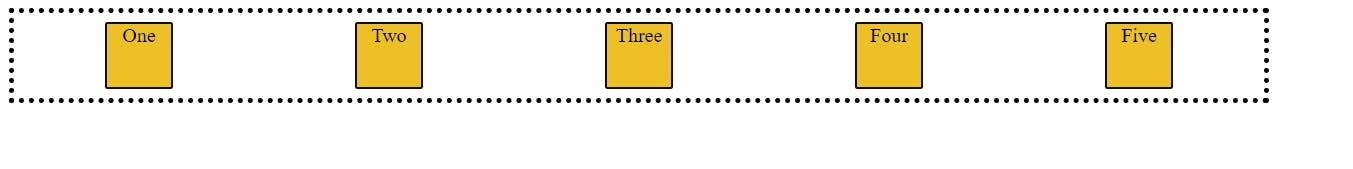
2.flex-end -> This property will moved the item's inside the container toward the end of the axis with even space distribution and also maintain the order
  .container{
        border: 4px dotted black;
        display: flex;
        flex-direction: row;
        justify-content: flex-end;
     }

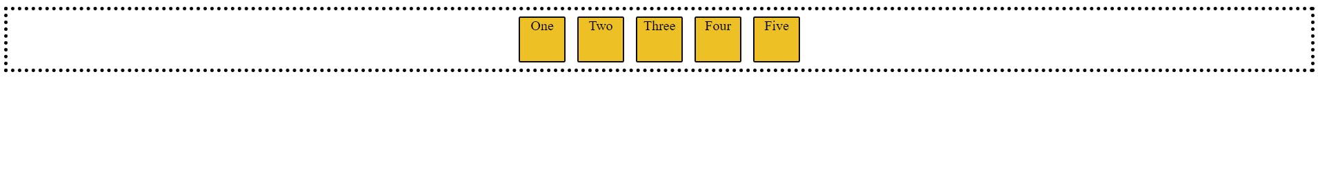
3.center -> This property will moved the item's inside the container toward the center of the axis with even space distribution
.container{
        border: 4px dotted black;
        display: flex;
        flex-direction: row;
        justify-content: center;
     }
4.space-between ->This property take all the extra space present in the container and the evenly spreads the item's inside the container
.container{
        display: flex;
        flex-direction: row;
        justify-content: space-between;
     }
5.space-around -> This property is similar to the space-between but it also gives the extra space to the first and last item's of container
 .container{
        display: flex;
        flex-direction: row;
        justify-content: space-around;
     }
-align-items -> so align-items always work on the opposite direction of the justify-content (like if justify-content work horizontal then align-items will work vertical )
1.stretch(default)
.container{
        display: flex;
        flex-direction: row;
        align-items:stretch;
     }
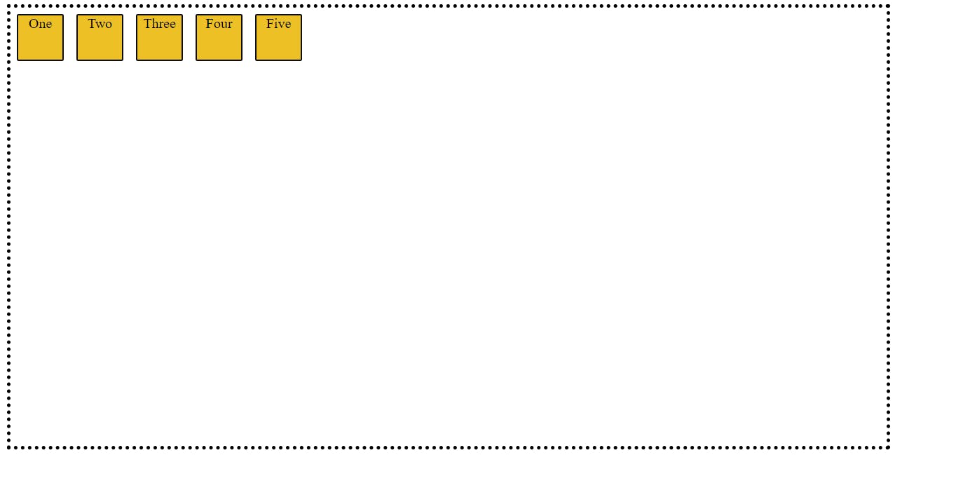
2.flex-start ->The item's inside the container will moved toward the start of the container with even space distribution
 .container{
        display: flex;
        flex-direction: row;
        align-items:flex-start;
     }
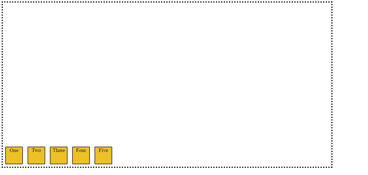
3.flex-end ->The item's inside the container will moved toward the end of the container with even space distribution
   .container{
        display: flex;
        flex-direction: row;
        align-items:flex-end;
     }
Now, Let's move toward the child's property
Before we move to understand the property let's observe the HTML code
<!DOCTYPE html>
<html lang="en">
<head>
    <meta charset="UTF-8">
    <meta http-equiv="X-UA-Compatible" content="IE=edge">
    <meta name="viewport" content="width=device-width, initial-scale=1.0">
    <title>Blog</title>
    <Style>
        .container{
            width: 1000px;
            height: 500px;
            border: 4px dotted black;
        }
     .container{
        display: flex;
        flex-direction: row;
     }
     #two{

     }

     .box{
        background-color: #EDC126;
        border: 2px solid #0D0D0D;
        border-radius: 2px;
        width: 50px;
        height: 50px;
        margin: 7px;
        text-align: center;

     }
    </Style>
</head>
<body>

    <div class="container">
     <div class="box">One</div>
     <div class="box" id="two">Two</div>
     <div class="box">Three</div>
     <div class="box">Four</div>
     <div class="box">Five</div>

    </div>

</body>
</html>
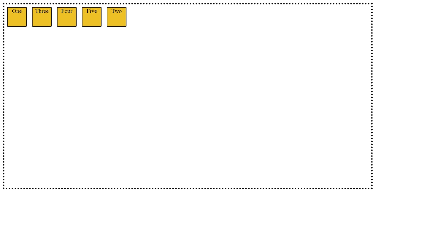
-flex-grow -> We will use this property only on the items inside the container not the container. This property will describe the extra space that item can take. you will be providing the numerical value according to the need. By default flex-grow value is 0
 .container{
        display: flex;
        flex-direction: row;
     }
     #two{
        flex: 2;
     }
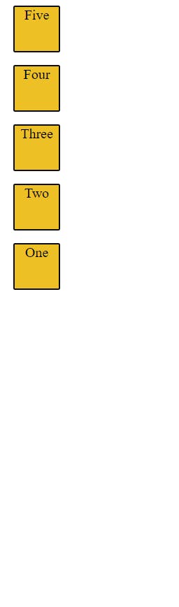
-order ->This property is nothing but only control the order of the items inside the container. you need to provide the numerical value.
.container{
        display: flex;
        flex-direction: row;
     }
     #two{
        order:4
     }
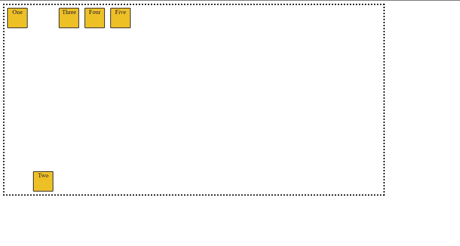
-align-self -> This property will help you to overwrite the default alignment. like it will change the position of a single item along with axis without affecting the neighboring items.
1.flex-start(Default)
2.flex-end -> It will move the item towards the bottom of page.
 .container{
        display: flex;
        flex-direction: row;
     }
     #two{
        align-self: flex-end;

     }
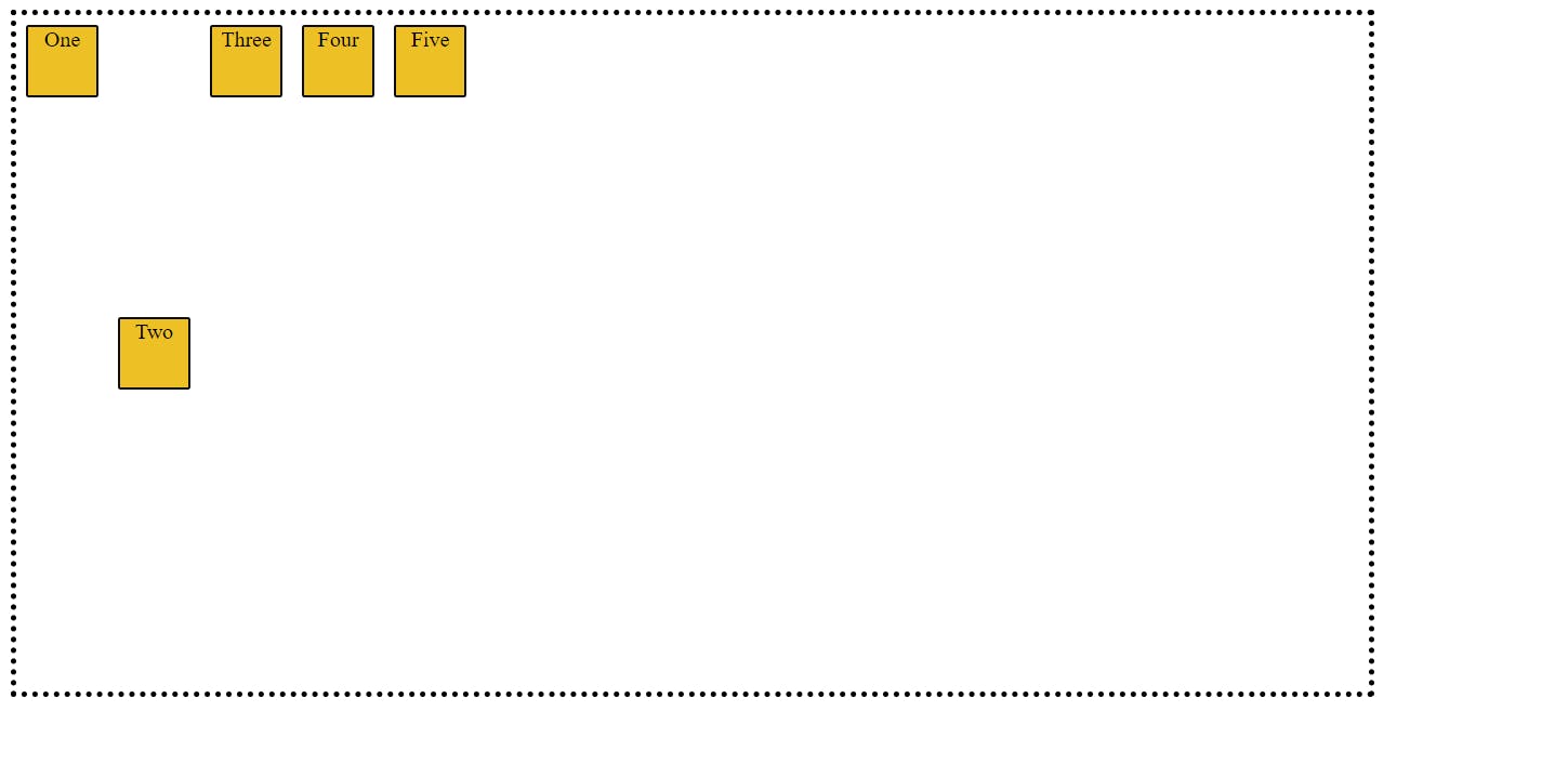
3.center->It will move the item towards the center of page.
.container{
        display: flex;
        flex-direction: row;
     }
     #two{
        align-self: center;

     }
4.stretch
.container{
        display: flex;
        flex-direction: row;
     }
     #two{
        align-self: stretch;

     }
So , I guess now we have better understanding of the flexbox. now we should go and practice's it . To practice's and get better understanding on the flexbox we can use this flexbox froggy game website try to complete all the level of the game Flexbox Froggy